Earthcope · UI/UX case study
Fall 2017 · Brown University
Pick a place on the globe,then see it changeacross years and hours.
Earthcope is a concept app for browsing nature photography by location. In a team of three, we took it from sketches to an interactive prototype and a round of remote usability testing.
- Team
- Wenxi Zhang, Xuefei Yang, Yunmeng Dai
- My role
- Proposed the concept and designed the UX flow framework; co-designed the hi-fi prototype and the usability test with the team
- Context
- CSCI 1300 User Interfaces and User Experience · Brown University · Fall 2017
- Methods
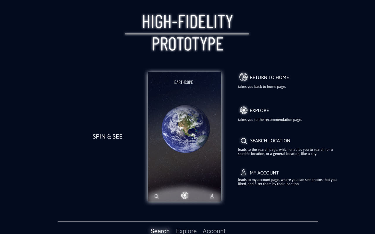
Design an interface from a problem statement alone.
The assignment was to pick an early-stage startup's stated problem and design an interface for it from scratch — ignoring anything the company had already built — then sketch, prototype, and test it.
I proposed the idea we went with: an app for people who love nature photography, where you browse professional photos by place rather than by feed. You pick a location on a 3D globe, by keyword, or through featured collections — then see that place across the years, or across the 24 hours of a single day. Photos can be saved to a collection, and photographers followed.
Three directions, then one.
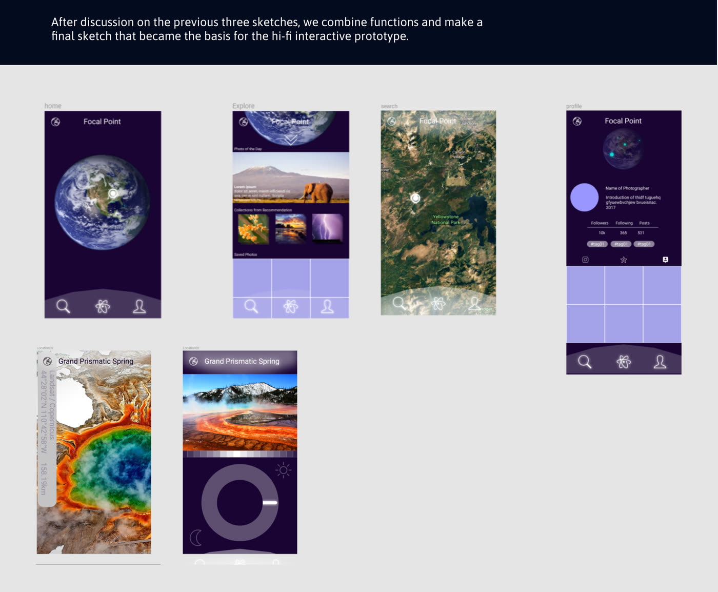
Each of us sketched a full set of major screens in a substantially different direction. Mine (Sketch #2) was the UX flow framework: from a hand-drawn map of the screens to linked wireframes that connect the globe, a single location, its timeline of years, a “today here” view, and a 24-hour dial.
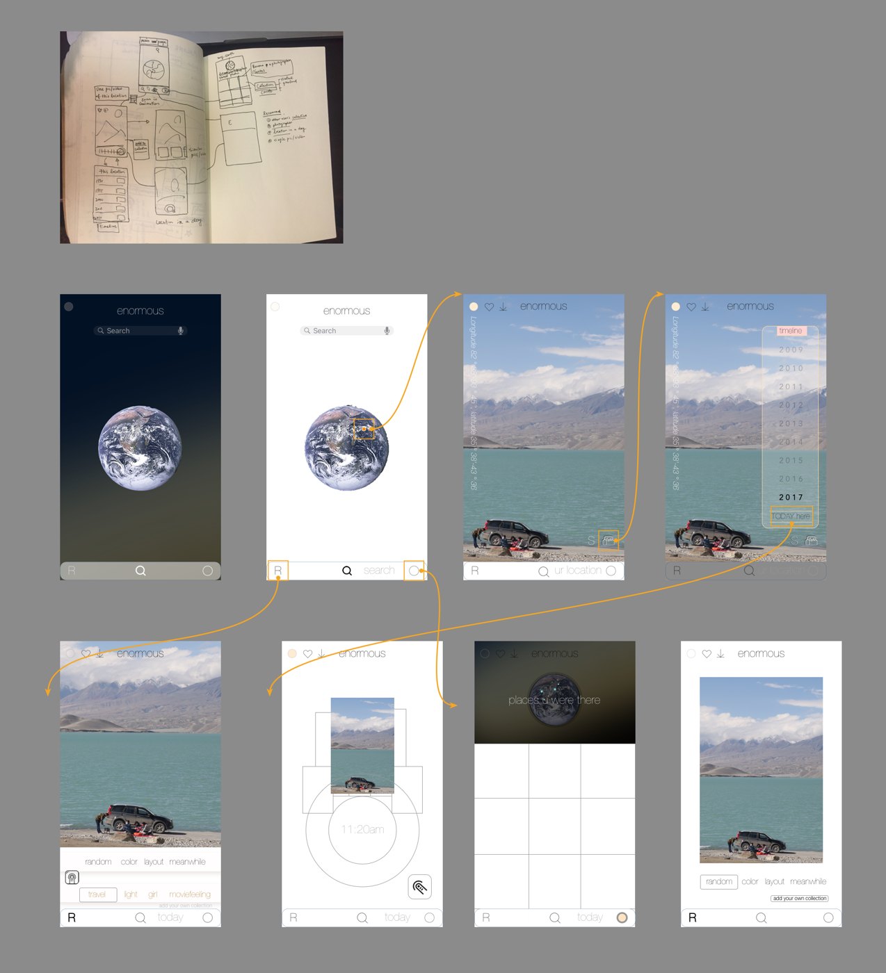
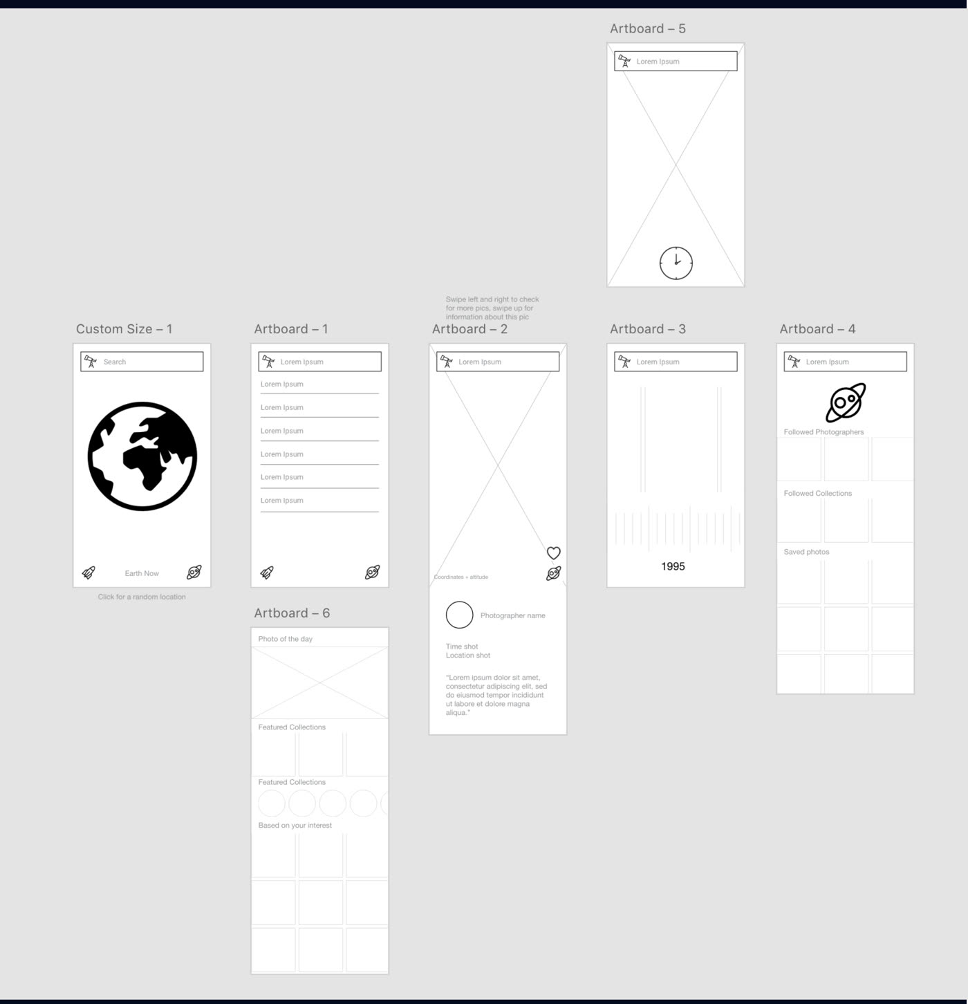
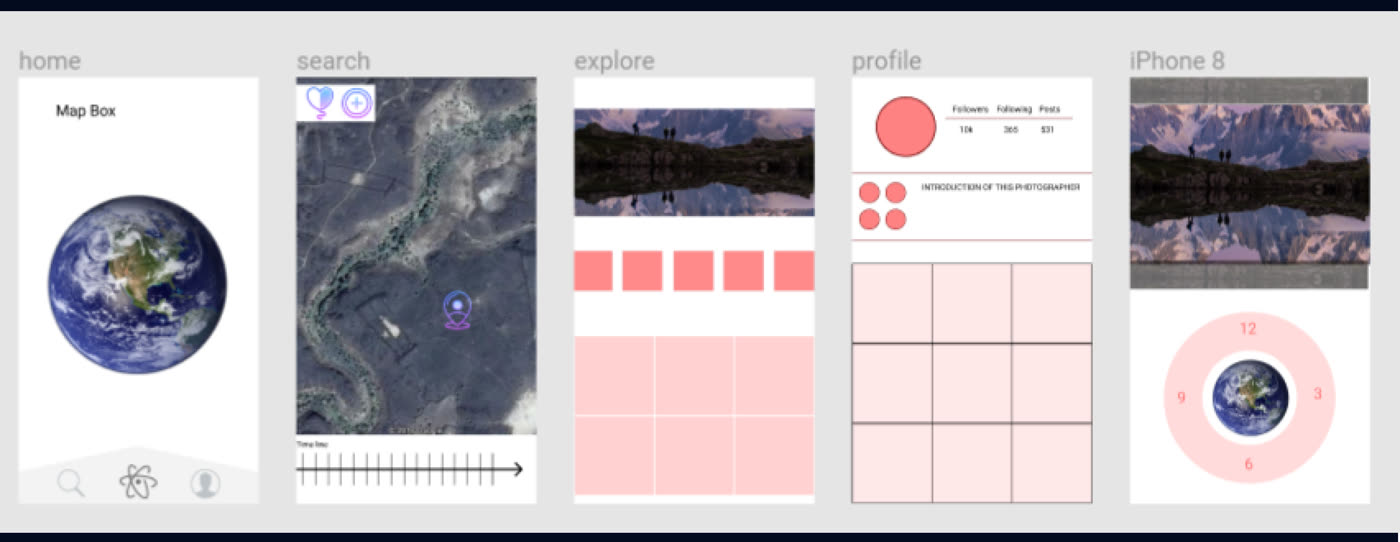
We then combined the strongest functions of the three into a final sketch, which became the basis for the hi-fi prototype.
Browsing by where, then by when.
- Where
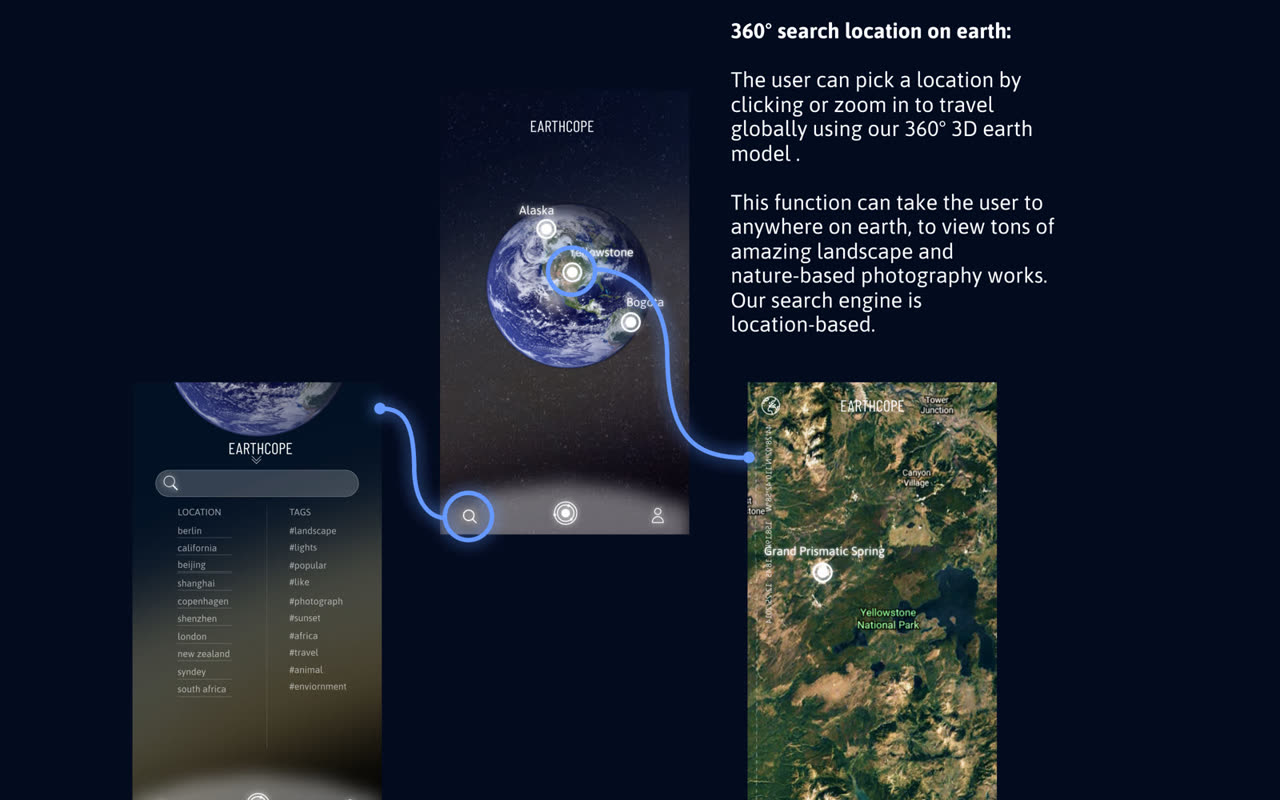
360° search on the earth. Pick a location by clicking or zooming into a 3D earth model, or search by keyword; the search engine is location-based.
- Across years
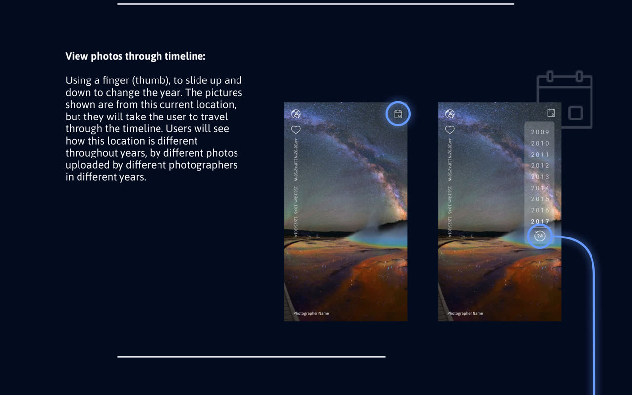
A timeline of years. Slide a thumb up and down to travel through time at the same place, through photos uploaded by different photographers in different years.
- Across a day
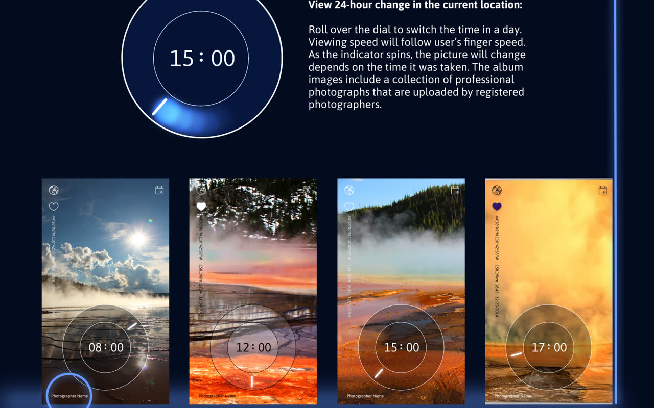
A 24-hour dial. Roll the dial to move through one day at this location; viewing speed follows the finger, and the photo changes with the time it was taken.
A hypothesis, 24 tasks, three remote participants.
We tested the interactive prototype with three remote participants on UserTesting.com. Our hypothesis was that a new user could pick or search for a location, browse its photos through the timeline, add favorites to a collection, follow photographers, and curate a personal collection.
The 24 tasks walked participants through each set of functions and kept asking for feedback along the way — several asked them to describe a screen before clicking anything, so we could compare their expectations with what the interface actually did.
- Task 01Informed by the name and the visual elements of this app, what do you think this app does?
- Task 03Use the search function to find a specific location you want to browse photos for. Are the suggested search and tags helpful?
- Task 08Browse more photos through the timeline, then find the photos that describe this location across a day. How hard was it to find the way back?
- Task 09On the location-in-a-day page, before clicking anything, describe what you think this interface does and how you would look for photos throughout the day.
- Task 13On the photographer's page, follow this photographer. How hard was it to find the follow function?
- Task 24What other functions do you wish you to have in a location-based photography app like this?
The concept landed; the name and the icons did not.
All three participants enjoyed the visual design, the concept of a location-based photo browser, and especially seeing one place across a 24-hour collection of photos.
The name and home screen suggested astronomy, climate, or space travel — not photography. The “collect” (star) and “like” (heart) icons were hard to tell apart, and pages and icons lacked text labels.
The test also taught us about testing. Participants navigated with the testing tool's own arrow buttons rather than the app's, so we learned little about in-app navigation; two of three treated the mobile prototype like a desktop site, hovering to find what was clickable. A next round should run on mobile devices, with more concise tasks.
From the findings to the next iteration.
- Name
A more descriptive name, and hints on the home screen that this is a photo-browsing app.
- Labels
A word under each icon — “Explore” under the explore icon — to shorten learning time.
- Gesture
Rotate the 24-hour clock with a finger, with viewing speed following the rotation.
- Motion
Animated transitions so traveling between places feels continuous.
- Content
A fuller photo library to demonstrate the calendar and 24-hour views end to end.
In one line